

Het is maandagavond en je zit een beetje verveeld op je telefoon. Je opent de appstore om te kijken of er nog een leuke app te downloaden is; misschien een spelletje of iets om te lezen. Je gaat op zoek en wordt overstroomd met keuzes: duizenden apps passen bij de door jou ingetikte zoekopdracht. Je scrolt even door de bovenste paar opties heen en kiest dan de app die jou het meeste aanspreekt. De reden dat juist die app je aanspreekt is waarschijnlijk omdat het icoon eruit springt of omdat het je bekend voorkomt. Wanneer je zelf een app-icoon nodig hebt voor je app, dan moet de app die eruit springt natuurlijk jouw app zijn! In de zee van apps wil je dat die van jou opvalt. En een zee van apps, dat is het zeker…
Apps galore!
Statista meldde dat de Apple App Store in 2018 zo’n 2 miljoen apps aanbood, en de Google Play Store zo’n 2,1 miljoen apps. Ook meldde het bedrijf dat er in 2018 zo’n 205,4 miljard apps werden gedownload en de verwachting is dat er in 2022 zo’n 258,2 miljard apps zullen worden gedownload. Een flinke groei dus! Door het grote aanbod aan apps moet een app dus goed kunnen concurreren. Anders verdwijnt hij in de massa van apps die worden aangeboden en dat is natuurlijk niet de bedoeling! Het maken van een goede eerste indruk is daarbij belangrijk. Dat doe je dan natuurlijk door het hebben van een goed app-icoon! Maar waar let je dan op?
Simpel en minimalistisch
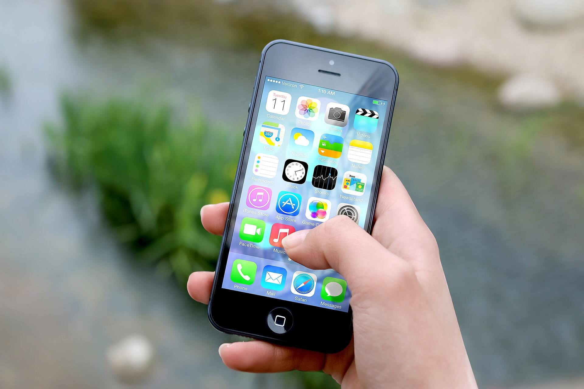
Keep it simple, stupid! Dit principe (afgekort KISS) wordt veel gebruikt in de grafische branche, en staat voor simpliciteit en minimalisme. Voor het ontwerpen van een app-icoon is dit erg belangrijk; de ruimte van een icoon is immers klein. De beperkte oppervlakte van een app-icoon moet daarom nooit te druk lijken. De consument moet in één oogopslag de app kunnen begrijpen, en wanneer het icoon heel druk is zal dit niet kunnen. Daarom zijn minimalistische iconen vaak beter dan heel drukke iconen. Kijk maar eens naar de apps op je eigen telefoon. De meeste apps zullen waarschijnlijk een simpel, rustig icoon hebben!
“Je wil een slechte eerste indruk natuurlijk voorkomen”
Luxe looks
Als een app-icoon er goedkoop uitziet, zal er negatief over de app worden gedacht. De consument zal denken dat de app niet goed zal zijn omdat het er goedkoop uitziet. Deze eerste indruk wil je natuurlijk voorkomen. Bedenk maar eens hoeveel apps je niet wilde downloaden vanwege het goedkoop uitziende icoon! Daarom moet het app-icoon er natuurlijk goed uitzien. Hoe je dit kan doen? Zorg voor een goede ontwerper! Iemand met ervaring en die goed meegaat met de tijd.
Kleurgebruik
Door een mooie, opvallende kleur te gebruiken valt een icoon op. Het beste is natuurlijk om de kleur van je bedrijf te gebruiken, aangezien dat aansluit bij de branding. Daarnaast legt het ook meteen een connectie tussen app en bedrijf. Wanneer je app opvalt tussen alle andere apps, is de kans groter dat een consument de app zal downloaden. En dat is natuurlijk precies het doel! Kijk maar eens door jouw apps heen; je zal zien dat veel van de apps een relatief felle, opvallende kleur gebruiken.
“Test je icoon op verschillende achtergronden”
Overal opvallen
Je wil niet alleen opvallen in de appstore, maar natuurlijk ook op het device van de consument! Het gebeurt namelijk regelmatig dat een app gedownload wordt, maar dan toch niet wordt gebruikt. Dat wil je natuurlijk voorkomen. Dit is te voorkomen door de app aantrekkelijk te maken op verschillende achtergronden. Door een icoon te testen op verschillende achtergronden kan je erachter komen of het icoon op dit gebied geschikt is.
Uiteindelijk komt het erop neer dat je maar één kans hebt om een eerste indruk te maken. Dus zorg ervoor dat deze goed is! Als je het goed doet zal je om de juiste redenen opvallen in de zee van apps. Vind je het alsnog moeilijk om een goed app-icoon te ontwerpen? Dan mag je ons natuurlijk altijd bellen.
Geschreven door
Laura Nijhuis